
ClickClinicals Branding
The development of an innovative digital service conceived by Keypath Education to drastically ease the burden of studying nurse practitioners connecting with qualified preceptors.
-
+ NAMING
+ BRAND STRATEGY
+ BRAND CHARACTER & VOICE
+ TAGLINE
+ LOGO SYSTEM
+ COLOR PALETTE
+ PHOTOGRAPHY STYLE
+ PHOTOGRAPHY DIRECTION
+ PATTERNS & TEXTURES
+ WEBSITE DESIGN DIRECTION
+ UX / UI DESIGN GUIDE
+ ONLINE BRAND GUIDE
THE PROBLEM
Currently most nurse practitioner students are left to fulfill the final step of their education (clinical experience) on their own. They need to track down a preceptor (a practicing nurse practitioner willing to take them on as an aid), ensure the clinical experience meets their university requirements, document the experience and then file it for credit.
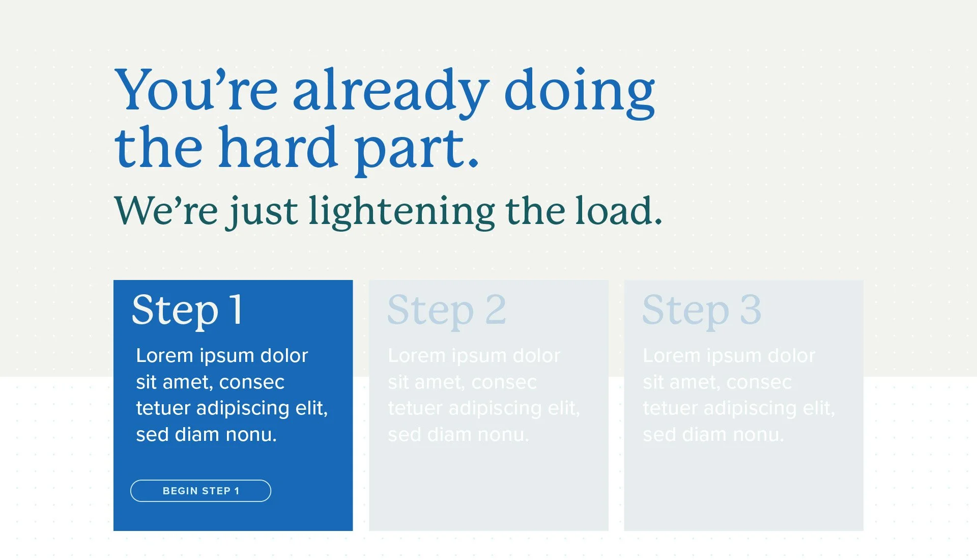
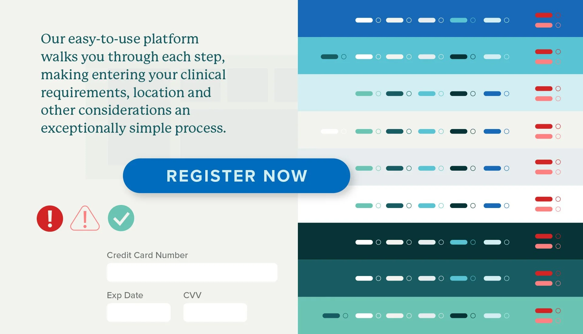
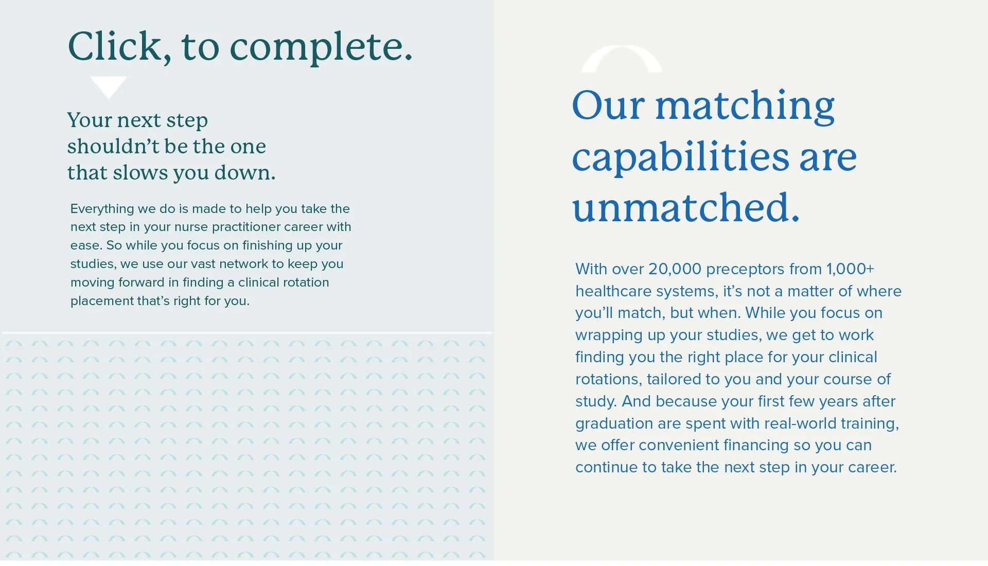
The new direct-to-consumer service is built to facilitate connections between students and preceptors, finding and matching agencies and licensed professionals with students so they can complete their programs required experiential learning. This service cuts the student burden from days of work searching for a qualified preceptor to mere hours. The brand required a shift in strategy and approach from the university-directed marketing efforts Keypath is otherwise engaged in.


OUR APPROACH
Capture the vision and vibe needed to define this under-developed market. From there develop a flexible, visual/verbal brand to get the client’s internal teams running forward to build everything needed to get the service off the ground quickly, and with confidence.
THE WIN
Working closely with the executive team at Keypath, we were able to pack technological sophistication and a confident sense of experience into the visual identity—after all, Keypath has been supporting university learning programs for over a decade—pairing it with a verbal identity that speaks to all audiences with equal elloquence. Visually rich and articulate, the brand can shift gears to appeal to all audiences. The design system rolled smoothly into an atomic design methodology, allowing the internal web development team to quickly move from wireframes, to full content, to a functioning e-commerce site in a matter of weeks.
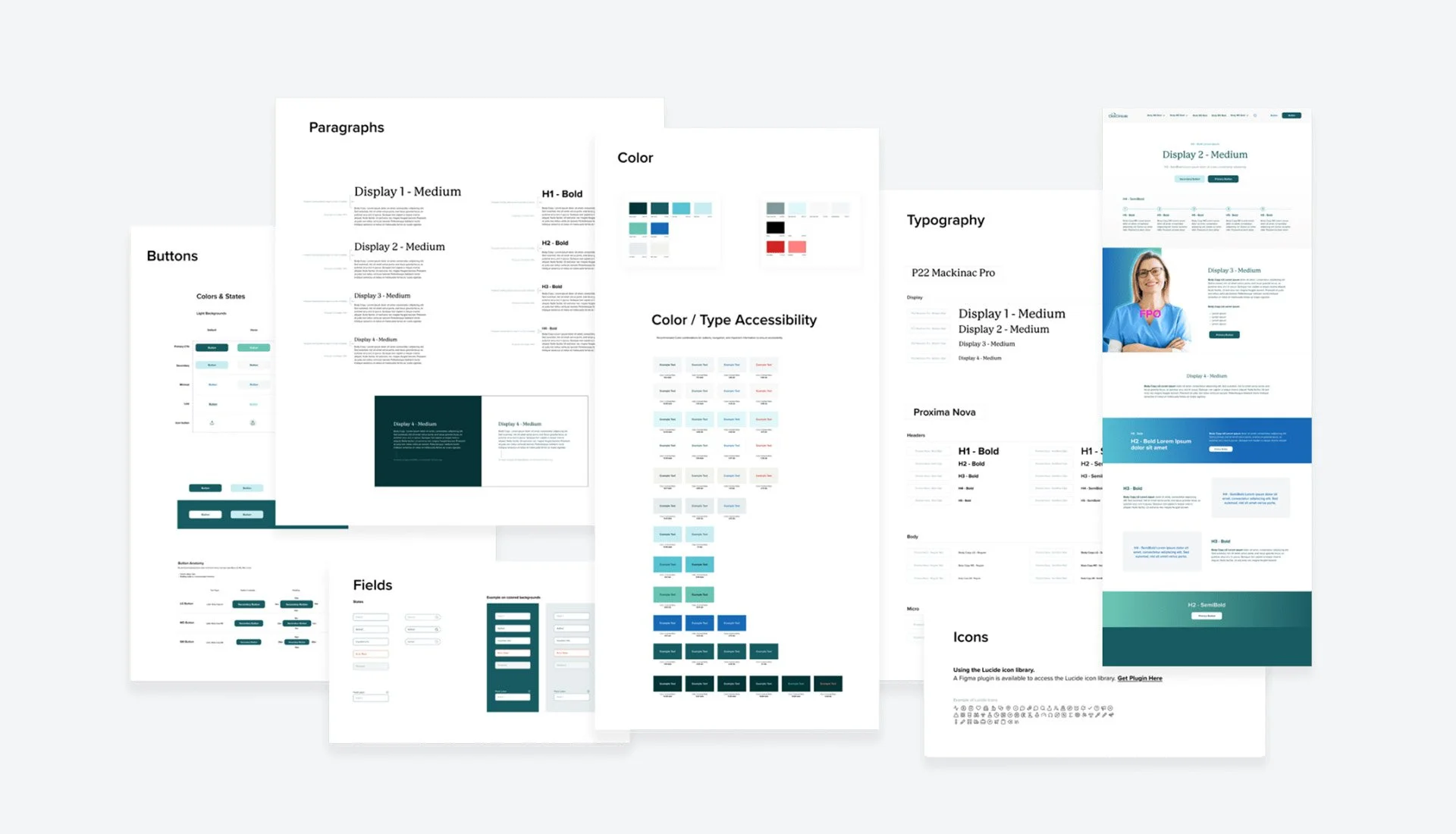

UI System & Brand Guide
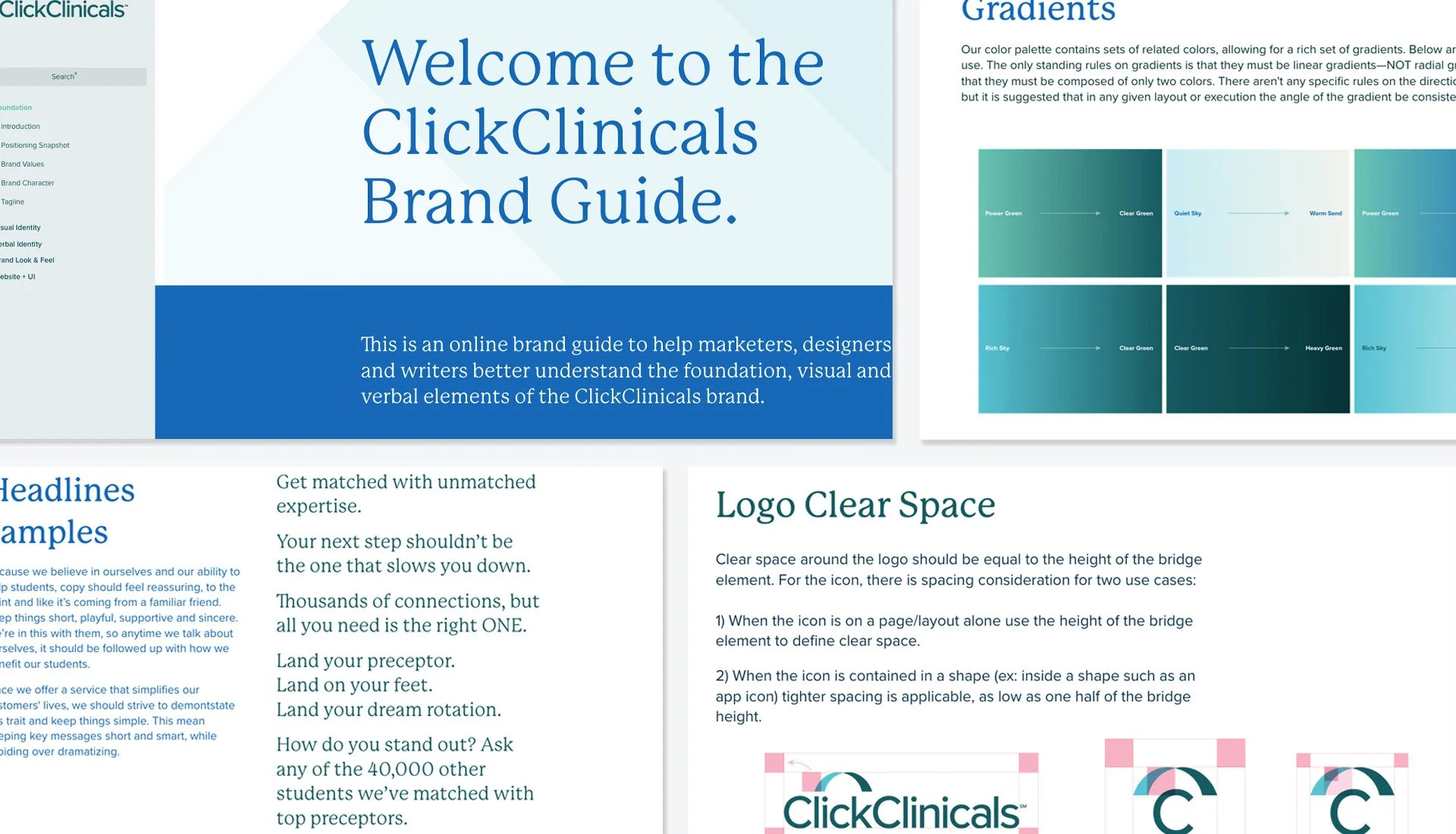
One of the more important elements we created and handed off to the Keypath team was an atomic design approach to quickly implement the brand into the e-commerce site. This was further supported by the online brand guide that captured and explained the vision, strategy, tone and visual direction of the brand.